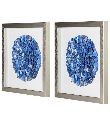
Before considering the specifics of creating a wall gallery or pattern, you'll want to follow these easy-to-apply principles to acquire proper symmetry. Laying the pieces out on the floor in a few different arrangements to get a visual sense of how the art will look together on a wall is also a good idea.

If you want your canvas art to retain its vibrant appeal, avoid hanging the art in space with a lot of sun glare. Art is to be admired for many years, not become prematurely faded and washed out.
Place personal photos or images with fine detailing on a wall free of large furniture obstructing a close view. It's ok to hang abstract or art with bold subject matter behind a piano or couch. And lastly, the center point of the canvas should be at eye level with the average person, around 57".
After performing some of the above tips, you'll probably better understand how and where you want to hang your canvases. We'll look at a select sample of layouts you can change up from time to time to give your space a refreshed look. Remember, balance is crucial, so let's grab the level and measuring tape and get to work!
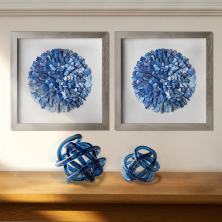
Arranging artwork in a grid or square on a wall can give your room a clean, polished look. Each piece, carefully positioned for symmetry from the same collection or different disciplines, can draw out detailed contrasts or provide complementary elements to a space. According to a New Your Times article, leave a 1-3 inch gap between images to keep a sharp square.
Horizontal Line
The horizontal line is a great way to cover blank space and create a visual border above furniture or larger art pieces. If pieces are not the same size, place the larger of the three as the focal point and maintain the 1-4 inch gap between each. Use a level to keep an even line regardless of positioning.
Vertical Line

Think of an isolated narrow wall or the space between furniture as a beautiful opportunity to show off your collection in an unconventional way drawing the eyes up and down. To get the best aesthetic outcome, use the centermost piece in the vertical line as the 57" height guide and follow the same spacing limits as the horizontal line setup.
1 x 2 x 1 OR 2 x 2
Square or in-line placements may be too conservative for some people's experimental tastes. Branch out from the norm with the 1 x 2 x 1 or 2 x 2. Hang two prints vertically as the focal point with a single image centered on either side in a 1-2-1 layout.
The 2 x 2 is structurally similar to the grid, with one exception. Slide two of the pictures down about 6 inches for an uneven hang that evokes balance with same-size canvases and equidistance between pieces.
So many more layouts not shown here exist in the creative space. Use the floor layout method to test patterns against available space and what looks good to you. Most of all, have fun trying new designs. You can always change it up.

