

There are many fun elements that go into the modern farmhouse style. From shiplap to mason jars, wire baskets to galvanized metal accents, there are certain essentials that should be present in a true farmhouse-style space.
With all that can go into the farmhouse aesthetic, some of the most commonly incorporated elements are beautiful, rustic signs featuring vintage typography! Because vintage typography spans countless generations and design periods, you’ll be certain to find a something to suit your personal taste.
One important thing to remember when selecting a sign with vintage typography is the kind of atmosphere you’re trying to establish for your space. Different typesets bring with them different moods, so it’s helpful to know what sets them apart.
Although this is by no means a complete list of the typesets you might see on vintage signs, here are some of our favorite examples!

Letterpress Typography Sign
Invented by Johannes Gutenberg in the mid-15th century, letter-pressing was one of the earliest methods of printing and was commonly used for nearly 500 years (it doesn’t get much more vintage than that!). Although technically a printing technique, letterpress is now usually known as a typographic style, characterized by a slightly imperfect and engraved appearance.
As far as decorative signs go, it’s common to find letterpress typography on cut-out signs because the process is so similar. This is the perfect typographic style for a more masculine room or for a space with clean lines.

Didone Typography Sign
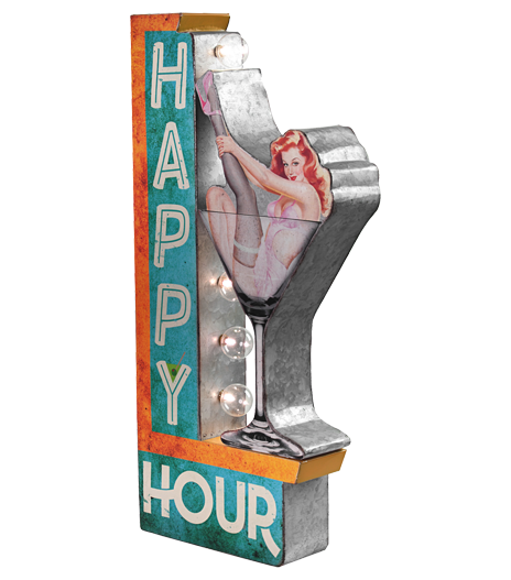
Not sure what a didone is? Not to worry! Didones are a style of typeface that go back 200 years or more, but became quite popular in the 1950’s. Didone typography is a good marriage of masculine and feminine, which is why you’ll commonly see this kind of vintage look on both old bar signs and on the covers of mid-century fashion magazines.
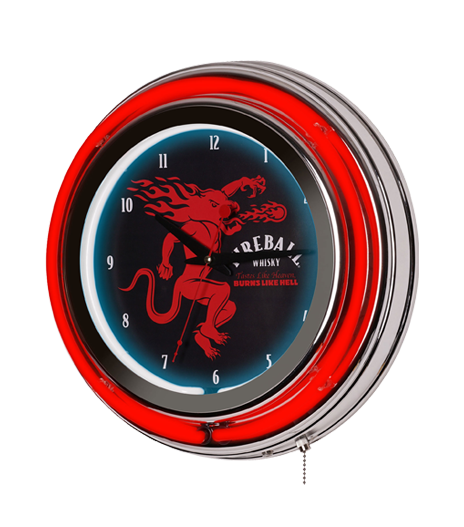
If you’re looking to infuse a rustic vintage look using didones into your home, the “man cave” is a good place to start. Consider adding a vintage sign to a wet bar area – although most mid-century typefaces were designed to be clean and crisp, the worn and aged appearance of these signs adds uniqueness and rugged character. While you’ll want to be careful not to overwhelm your space with too many print signs, a bar sign with didone typography and festive lighting can add dimension and authenticity to the space.

Art Deco Typography
Art deco typography is another style often seen on vintage farmhouse signs. Characterized by its geometric lines and bold appearance, art deco is a decorative style which reached its height in the Golden Age of the 1920s. When most people think of art deco, they envision the glam of the Roaring Twenties, the jazz age, flappers, and The Great Gatsby (heck – sometimes they even think of Gotham City!). However, art deco in farmhouse decor often comes with a more down-home, rustic appeal.
In the farmhouse style, art deco can be spotted due to its rounded geometry and the elongated lower-half of its letters. Although usually associated with glitz and glam, it can also be used to highlight the vintage aesthetic of an item. Because it’s based on geometry, art deco typography is clean and can be imbued almost anywhere. It’s especially common in kitchen, restaurant, and gas station designs.

Clarendon Typography
Ever watch a John Wayne flick or seen an old-timey wanted poster? Then you’ve definitely seen vintage typography like the clarendon typeface. Created in 1845, this slab-serif typeface has definite masculine undertones and is another style commonly spotted on bar signs and western decor.
A sign with vintage typography like clarendon would be best suited for a home with a highly-rustic look or for wet bar areas. Although you’ll likely use clarendon typography to evoke a more serious mood, these signs would also make for an interesting contrast when used in spaces that use lighter colors, cleaner lines, and which have a more feminine appeal.

Brush Script Typography
Designed in 1942, the original brush script typeface was meant to emulate the appearance of ink-and-brush handwriting. Luckily for us, this script has regained momentous popularity, thanks to the homespun nostalgia it tends to evoke.
Arguably the best thing about brush script is the way it’s evolved into many variations, and therefore, many associated moods. Brush script ranges from being quite “loopy” and playful, to much more irregular and serious. With that said, there’s no doubt about it – brush script is a highly feminine typeface. As such, you’ll commonly spot these pieces hanging in cozy bedrooms, nurseries, spas, and kitchens. The style of brush script you choose (just as any other vintage typography) really depends upon the mood you intend to evoke.
What’s your favorite kind of vintage typography? Do you have any vintage signs hanging in your home?