
So far we’ve talked a lot about some basic neutral tones to use in your farmhouse decor color palette: off-white, grey, beige, tan, light and dark shades of brown, natural wood. These are great to work with, but sometimes you want a little splash of color! Today we’re going to talk about a few farmhouse colors that you can sprinkle into your home decor with accent pieces that will still support that gorgeous rustic look.
Please note that while these colors all look phenomenal when used as accents in farmhouse decor, not all of them pair well with all the others. We recommend picking one or two accent colors for a given room, rather than trying to make all of them work at the same time!

Light, muted greige colors
Before we jump into the more full-bodied colors, let’s have a moment of appreciation for some of the subtler colors of farmhouse decor. Light beige-grey (or “greige”) hues with a touch of blue, green, or yellow are a fantastic way to add color to large pieces or full walls without having them steal the spotlight. These shades are just a notch more colorful than most neutrals, and are extremely versatile.

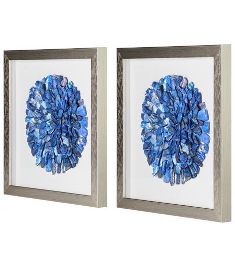
Navy blue
If you want the visual statement of a dark cool color without the occasionally funereal vibe of too much black, navy blue is here for you! Navy is timeless, and it goes beautifully with so many colors and styles. It manages to be bold and colorful, yet sleek and sophisticated all at once.
As the darkest color on this list, navy is great for contrasts. Pair a deep navy blue with bright white for a combination that really pops. You can find navy shades that have more blue, white, grey, black or even green to them, so try out different shades until you find your favorite.
If you’re looking for another dark color, you can of course go with solid black or charcoal grey, but also consider introducing some oil-rubbed bronze. Oil-rubbed bronze is much darker than standard bronze; it looks almost black with copper accents. Speaking of which….

Copper and rose gold
We talked a bit about how warm metals can add to a space in our post about farmhouse lighting, but this applies to other home decor as well!
While silver galvanized metal is absolutely the #1 metallic component of the farmhouse color scheme, too much cool metal can feel a little too industrial. Warm metals are welcoming and eye-catching. Try introducing copper, rose gold, or gold decor into your color scheme with accent pieces.
Copper table top decor like sculptures and figurines, a rose gold table lamp, or gold brass fixtures are all striking ways to add warm metallic colors to your room scheme. Consider subtle undertones when choosing your decor. Paying attention to how much silver or red or brown is in a metallic hue will help you find complementary combinations to tie the room together.

Barn red
If you’re looking to an old farmhouse for design inspiration, you don’t have to stray far to catch sight of a barn. From fire engine red to deep almost-burgundy to sun-bleached faded red, barns are known for their gorgeous colors.
We love red in distressed wood wall decor, red enamel dishware, and red metal appliances. The vibrant color calls attention to texture and shape in a unique way. Red patterned fabrics make great rustic accent pieces when used for curtains, pillows, or throw blankets. We love the old-fashioned feeling of red and white buffalo check, especially in a charming vintage style kitchen.

Blush / Pale pink / Rose pink
If bold red isn’t quite your style but you’re looking to add more warmth and color to your farmhouse palette, put on a little blush! Light pinks bring a delicate liveliness that is fun without dominating the whole look of a room. There are a number of gorgeous options within light pink, so you can find a hue that blends nicely with the rest of your decor.
Blush is a subtle light pink, often with barely there orange undertones with peachy warmth. Dusty rose is a slightly cooler soft pink, with lavender-grey undertones. Both are sophisticated yet inviting, using understated color to make a strong visual statement. Pale pinks look incredible with chippy antiqued white, dark grey, and navy blue. Fresh flowers, a piece of vintage furniture, a textured throw blanket, or even an accent door or wall are just some of the ways you can introduce pink shades into a room design.
To bring a sense of youthful playfulness to your space, try the classic light pinks of pastel pink or baby pink. If you find yourself wanting to pair pastel pink with pastel blues and greens and aqua decor, check out some shabby-chic style inspiration. Shabby-chic, like modern farmhouse, showcases the weathered look of well-loved vintage decor, but with a more colorful palette and French country influence. Pick and choose whatever elements you like best to create your dream home!

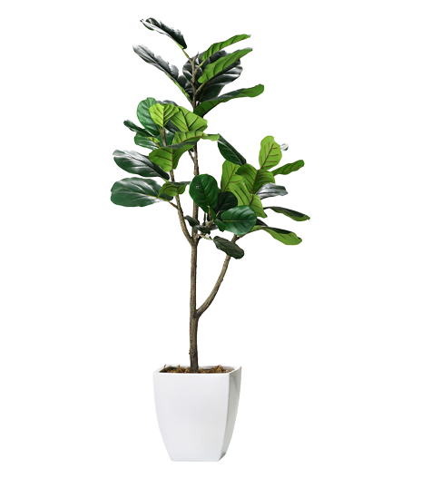
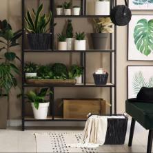
Living greens
Whatever your design style, the appearance of any room is improved by the green of a few plants. Display your greenery in mason jars, galvanized metal buckets, or vintage crates for that fresh-from-the-field look.
If keeping houseplants alive is not exactly your strong suit (us too!), but you want to give it another try, succulents that need little attention are your best bet. Spider plants are also quite hardy, plus they improve the air quality in your home. If you have more of a green thumb, try an indoor herb garden! Nothing tastes quite as good as fresh basil, mint, or thyme in a home-cooked meal.
While you won’t be able to eat them, faux plants are a great way to have greenery year-round regardless of how often you break out the watering can. Select a few artfully placed artificial plants in burlap-accented pots or vintage glass for your farmhouse living room, kitchen, or even bedrooms. Faux plants don’t have to be realistic to bring a little cheer to your home, either. We love vibrant green metal branches like this one for unique wall decor.
Shades of green inspired by nature can also come through in other forms of decor, like furniture pieces, home accents, and even wall paint colors. “Greenery” was Pantone’s color of the year for 2017, and “Verdure” is one of the palettes in their 2018 color trend predictions. Use green hues from the natural world to brighten up indoor spaces and inspire your next outdoor adventure.
Have you tried incorporating any of these colors into your farmhouse decor? Did we miss one of your favorite farmhouse colors? Let us know in the comments!